
 Chances are, if you’ve ever sat next to me during a seminar, lecture, colloquium, workshop, conference, or dinner, you’ve seen me scribbling away on something. Stylus or pen in hand, I’ll create landscapes of crudely drawn people or mountains or ships, encircled and dissected by wavering arrows and question marks.
It’s about time I admit it. I’m a doodler.
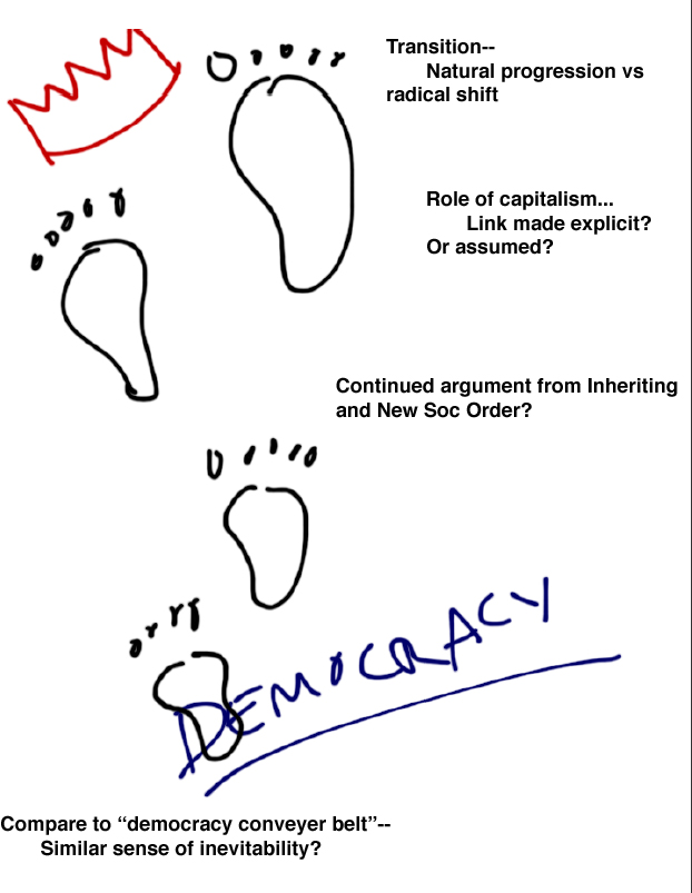
Since grade school, I’ve rarely taken traditional notes—instead I’ve illustrated and diagrammed my thoughts and observations, others’ quotes and arguments. If a lecture speaker uses a metaphor about a camel’s nose and a tent, you can bet that I will draw that conspicuous camel. And when she describes democracy walking in the footsteps of monarchy—don’t worry, I’ll get that too. Later, when I have a new research idea, it’ll become a swirling map of arrows, bubbles, and cartoons.
 Seminar rooms were usually a symphony of keystrokes, rapid firings of plastic buttons as classmates typed long, copious, and wonderfully detailed notes. I rarely opened my laptop once in two hours. And I wondered, did drawing make me rude? Distracted or inattentive? Hyperactive? It didn’t necessarily keep me up at night, but still I worried that I was either giving the wrong impression or missing out on something. So imagine how I felt when, still an undergrad, my dark (though not exactly hidden) secret was suddenly cast under a kinder light. Researchers and doodling advocates rushed forward en masse to proclaim: Doodling promoted better concentration and memory recall. Diagrams aided more efficient learning. Visual literacy was hip. Since then, I haven’t looked back. (For some recent and extremely helpful examples of doodling, see work by Sunni Brown, Dave Gray, and James Macanufo).
In fact, I would contend that every early Americanist—”naturally” visually inclined or otherwise—could stand to benefit from bringing some illustrations to their notes, ideas, teaching, and research.
First, think about bring drawing into the classroom. Many of our students are visual learners. And with the increasing emphasis on visual teaching materials, they’re all the more attuned to graphic and illustrative displays. But for as much as we spend on helping students interrogate textual sources, it’s still harder to get them thinking about perception and perspective in images. If you want to encourage familiarity with, say, eighteenth-century cartoons or seventeenth-century woodcuts, don’t just bring in examples. Consider, too, having students draw or diagram their own images. It’s easier to understand subjectivity in images of politics, exploration and contact, or war after creating your own portrayals.
Second, consider using illustration as method of recovering lost historical visuals. Imagine a world in which the United States seal looked remotely like this: 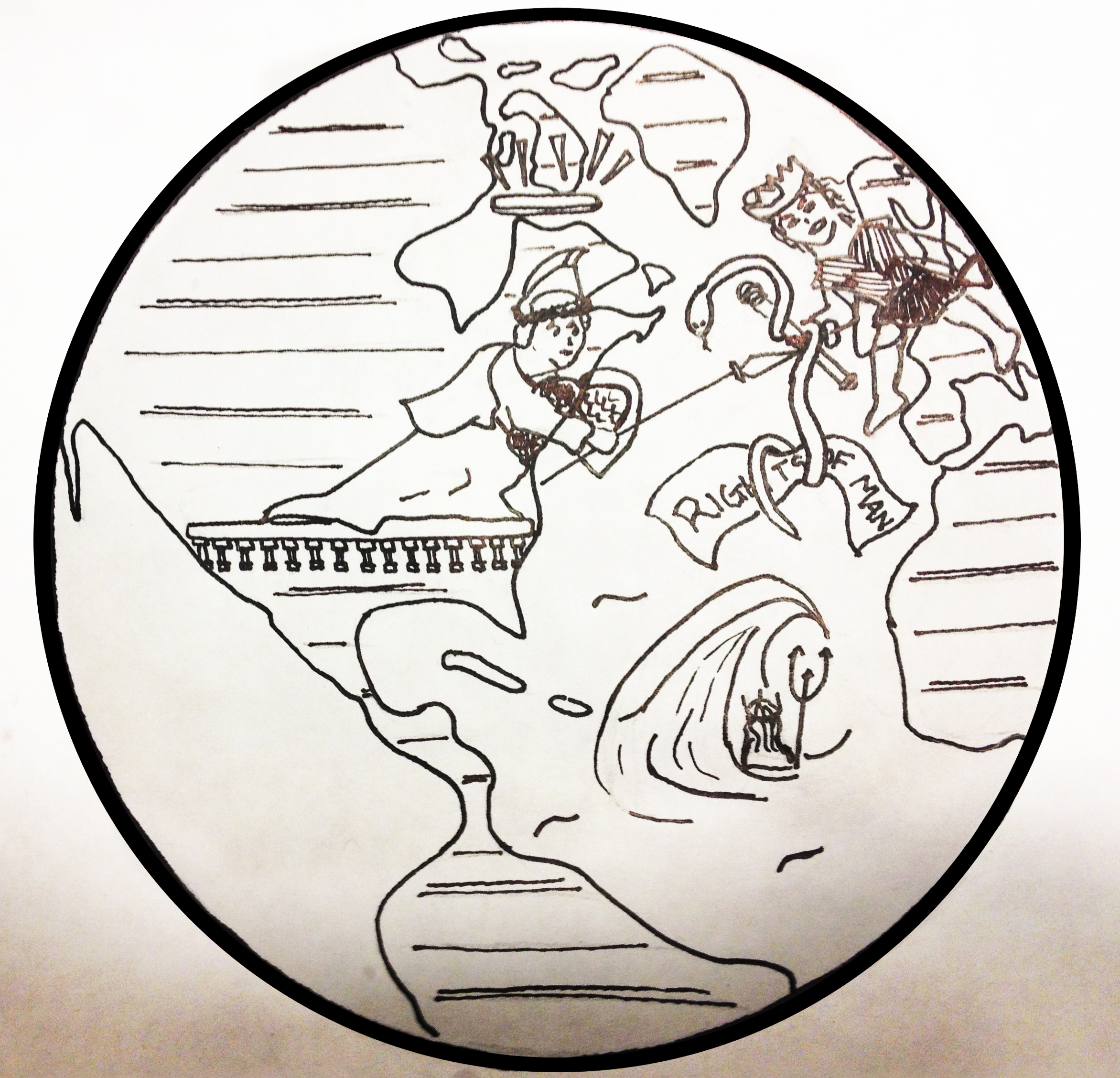
Alexander Hamilton did.
It’s one thing to read his description, which vividly features: Colossus, with an iron scepter entwined by a snake that is simultaneously strangling the words “Rights of Man,” striding across the sea towards Pallas, who stands poised to defend America’s honor with her radiated crown of glory and spear. (Hamilton’s description also adds: “It would improve the allegory to represent the Atlantic in a tempest, as indicative of rage, and Neptune in the position of aiming a blow at the Colossus with his trident.” Indeed.) It’s altogether another thing to see it—appalling in amateur hand—in all its grandiose mess. With other sources, I think of myself as poorly trained and inadequately skilled sketch artist: So often I find it helps to just quickly draw descriptions from travel accounts or newspaper items to get a better sense of looking through the eyes of my historical actors.
Third—and most importantly—bring illustration to your research. For every important event, circuit, idea, or argument in my dissertation, I need to be able to draw it. And I don’t mean simply outline. This is a firm requirement I’ve given myself, and I think for good reason. If I can’t draw it, then I don’t truly understand it.
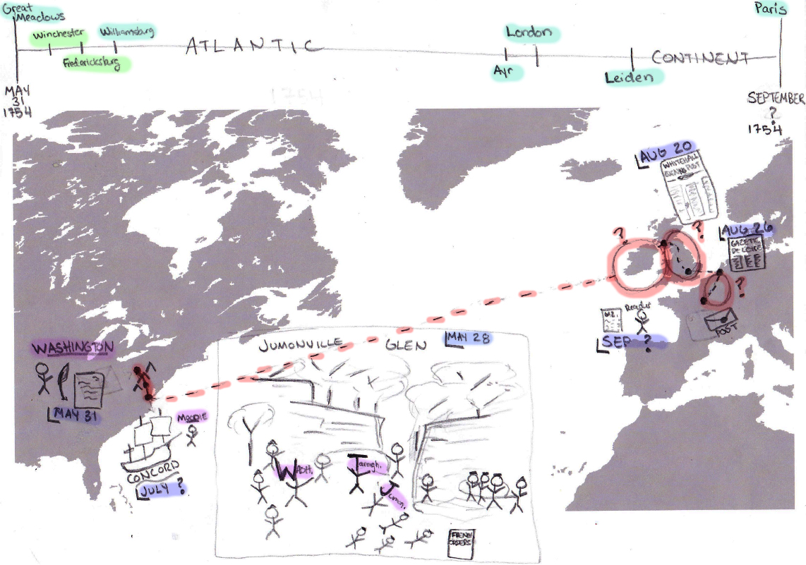
My quick drawings and sketches will never find their way into my final (or any other) dissertation draft, but they play an important role in the development of my arguments and insights. They precede all my other visual tools—GIS in particular. Spatial rendering programs are fantastic (and for anyone else working on the mid to late eighteenth-century Atlantic, you should absolutely know James Cheshire‘s work on shipping routes). GIS can certainly do far more than I could ever even attempt by hand, and it produces insights I’d be unable to discover otherwise. Yet I believe there’s something about trying to map something by pen first, to see if I really can understand geography and movement and space, especially when I have imperfect information, am not utilizing averages, or want to highlight one specific circuit.
And there’s something more to it than just that. My freehand maps don’t truly function as maps, but rather as compilations of all my relevant information and thoughts. I have a whole binder (and dropbox folder) full of silhouetted maps of the Atlantic World, North America, and Western Europe, backgrounds I use to loosely sketch timelines, information routes, textual details, events, as well as to highlight important missing information.
In fact, the most important function of these illustrations is to discover what it is that I don’t know.
- If, as I plot my event or circuit, I find that I can’t draw something, I ask myself a series of questions. Can I not draw it because I don’t know:
- An object? Do I not know what it looks like, its size, its color, its weight, its purpose?
- The actor/s? The name, affiliation, location? The number of actors?
- The geography? Do I not know the topography, the direction of the stream, the plant life? Do I not know it by season?
- The route? And if I have only a vague sense, do I not know if something moved on official roads, through postal routes, by water? Or the transportation vehicle?
- The date? Even the approximate?
 From there I have a better sense of what sources to revisit or discover, or what information I will ultimately have to gather from averages, patterns, or guesswork.
Now, of course we work with concepts. As historians, our job is not simply to retell events or list relevant details, but also to provide interpretations and structure causal arguments. But we never move directly to that stage—and illustration is a way to ensure we don’t try to move there too soon. It forces us to not only consider but identify the peoples and elements that make up larger ideas and phenomena.
One cannot exactly draw “capital” or “debt.” But one can draw the peoples, texts, and routes that made up, for instance, eighteenth-century networks of trade and lending. As early Americanists, we have the benefit of working on an era prior to the (effective) separation of transportation and communication. Everything circulated physically. As such, we shouldn’t think of concepts like capital, or the public sphere, without thinking about the very real peoples, things, and geographies that moved and constituted them. Simply put, drawing forces us to think about action and actors—to at least temporarily retreat from vague concepts and ideas and instead bring people and objects front and center.
For most, this may not seem worth the time or effort—especially to produce something that will ultimately be relegated to a box under the bed or a forgotten dropbox link (though I should note that most of my images take under 10 minutes). But give it a try. See if drawing and diagramming forces you to think more critically about your sources, your evidence, your assumptions, or, most importantly, your arguments. If for no other reason, remember that you spend enough time at your computer already. Live a little.

Pingback: More Information Reorganization – “History by Freehand: Drawing Your Research,” by Alyssa Zuercher Reichardt | The History Channel This Is Not...
Pingback: Guide to Mapping Early America with Basic GIS « The Junto